


Resume Help Zeynep İclal Akçakoca
Best Font for Resume: Size, Standard & Professional Pairings
Yeni CV örneklerini inceleWhich font works best for a resume? What fonts should you avoid? Sans serif or serif fonts? And what about font size? What about italicizing and bolding text? And what about those annoying section headings?
Such a simple act as selecting a typeface raises a lot of questions. You may now look away from your computer screen. This fast read will help you pick the ideal font for your resume.
This font reference will demonstrate:
- Which typefaces work best for resumes and which ones to avoid.
- Employers respond favorably to the font size you choose for your resume and cover letter.
- There are advantages and disadvantages for each suggested resume font to help you decide.
- Tips & strategies for using typical business fonts on a resume.
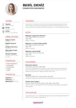
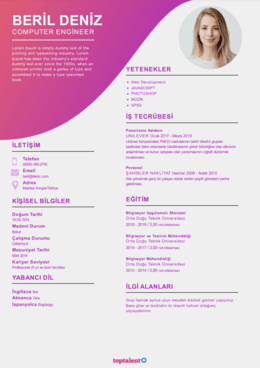
Would you like to cut down on time and have your resume ready in 5 minutes? Use our resume generator. It is quick and simple to use. In addition, ready-made content is available for quick addition. Create your resume using one of the 20+ templates offered.
What Font to Use for a Resume
According to our HR statistics research, recruiters and hiring managers initially review your resume for 7 seconds. The average individual reads these two phrases in about that amount of time. The typeface you choose must be readable. These are our suggestions:
Resume Font Size
The typical font size for resumes is 12 points, and it should be a recognizable and readable typeface. Your name and the heads of the sections should be highlighted in larger fonts. The smallest font size you should use is a sans-serif font at 10 points, although you might try something smaller if your content can't fit on one page.
Common Resume Fonts
- The most popular typeface is black Times New Roman in the size of 12 points.
- Other serif fonts with tails that are suitable are Didot, Book Antiqua, Georgia, Garamond, and Cambria.
- The sans serif (fonts without tails) fonts Calibri, Helvetica, Verdana, Trebuchet MS, and Lato are examples of good choices.
- Be consistent when using bold, italic, and CAPITAL LETTERS to draw attention to crucial information such your name and section titles.
Let's now examine more closely at each of our suggested resume typefaces.
Best Font for Resume in 2022:
1. Calibri
Microsoft hired Dutch type designer Lucas de Groot to produce Calibri as a replacement for the beloved Times New Roman as the Office default typeface. It's a modern typeface that avoids old serifs but without the dramatic flourish of other contemporary fonts, making it ideal for today's resumes.
Advantages: When a job manager opens your resume, Calibri will typically display correctly because it is the default typeface. The Type Directors Club's TDC2 2005 Type System Prize went to this expert and simple-to-read font.
Cons: Since Calibri is the standard typeface, other job seekers may also be using it, making your CV less likely to stand out.
An alternative is Carlito, a font designed by Google that is similar to Calibri, metrically appropriate, and meant to be an open-source replacement.
2. Cambria
Like Calibri, Cambria was developed in 2004 after being ordered by Microsoft from a Dutchman. It was "made for on-screen reading and to appear nice when printed at small sizes," according to Microsoft, because of its serifs (those tiny lines at the end of each stroke of a letter; we'll get to them shortly). This makes it a wonderful typeface for your resume's and cover letter's content.
Pros: Readers can quickly understand smaller letter sizes using Cambria.
Cons: It is frequently labeled as "traditional," which can make it less appropriate for work in more advanced industries.
As an alternative to Calibri, Google developed the open-source Caladea typeface, which is metrically accurate and comparable to Calibri. Now, it appears that Google Docs offers Cambria as an additional option.
3. Helvetica,
Neo-grotesque typeface Helvetica was created by a Swiss designer. Originally known as Neue Haas Grotesk, Linotype quickly acquired the rights to use it and changed the name to "Helvetia," the Latin name for Switzerland. It is a sans-serif font that is still widely used in the advertising sector because it is beautiful and simple to read. Major firms like BMW and the New York City subway system both employ Helvetica for their signage.
Benefits: Many experts consider Helvetica to be one of the most attractive sans-serif fonts. An excellent font for a CV!
Cons: Although Helvetica comes preinstalled on Macs, Microsoft Word doesn't have a list of fonts that includes it. If you wish to utilize it and don't already own a Mac, you'll need to get it.
Alternatives: Arial is the standard typeface for Microsoft Word and the default font for Google Docs, so it will display appropriately on most computers and on all platforms. It is challenging for the majority of non-specialists to tell the distinctions apart. Roboto is a different, less comparable resume typeface made by Google that is freely usable (like in our resume builder!).
4. Georgia
Georgia, which was created for Microsoft in the early 1990s, is still among the most widely used typefaces today. The New York Times online and other major organizations, including Yahoo, Amazon, and Twitter, utilize it. If you intend to send your resume as a PDF, Georgia is a typeface that is simple to read online.
Pros: Georgia can be found on several writing platforms. It may easily be used and makes a good substitute for other serif typefaces like Times New Roman. It was revised and re-released in 2013, making it current.
Cons: It could be challenging for you to stand out given Georgia's popularity. Additionally, it was influenced by 19th-century Scotch Roman designs, so if you want to stand out, you might want to choose something else.
Alternative: Even now, one of the most used resume fonts is Times New Roman. It's a boring font that people love to dislike because it lacks creativity, yet it's still a safe option for the majority of job applicants.
5. Verdana
For Microsoft, Matthew Carter designed Verdana as Georgia's sans-serif sibling. He created the font to be simple to read in computer screens' small print. One of the greatest professional fonts for cover letters, CVs, and resumes alike continues to be Verdana.
Pros: Because it was developed for small-print legibility, it's great for job searchers who need to fit more information onto their resumes.
Cons: Keep looking if you're looking for a "wow" CV font. Verdana and Arial don't look all that different from one another, and Helvetica resembles Arial.
Verdana can be replaced by the Futura typeface, although Ikea moved to Verdana in 2010 instead of utilizing Futura. Make of that what you will, but they paid millions to their marketing staff to come up with that idea.
6. Garamond
The designs for the Garamond font family date back to the 15th and 16th centuries. Garamond is often said to as timeless. Later, Jean Jannon created a typeface that is similar to most other digital renditions of Garamond. The most widely used member of this typographic family is Monotype's design from 1922, which is included with Microsoft products.
Advantages: Designers and advertising managers love Garamond. It satisfies all the criteria for a decent resume font: it's simple to read, appealing, and elegant, and it's not something that everybody and their mother uses.
Cons: Given that Garamond dates back to the 1400s, some would argue that its eternal quality is simply a more upbeat way of saying that it is ancient.
As an alternative, Cormorant, which draws inspiration from Garamond's design, is freely accessible and was developed with funding from Google Fonts.
7. Trebuchet MS
A trebuchet is a type of medieval siege engine that is used to fire slow-moving, agonizing-death projectiles over defending walls and great distances, such as buckets of stones or dead people to spread disease. That moniker "seemed like a perfect name for a font that propels words across the Internet," according to Vincent Connare. Connare is an expert on fonts; he is also the creator of the well-known Comic Sans font, which is not ideal for resumes.
Positives: Microsoft released Trebuchet as one of their primary online fonts. Even on competitors like Google Docs, it is simple to locate.
Cons: Trebuchet MS's commercial version, Trebuchet Pro, costs money if you wish to use some of its extra capabilities, such small capitals or text figures.
Trebuchet's good replacement is Fira Sans, which is freely accessible on Google Fonts. Additionally, Source Sans Pro is free to use for business purposes (you may find it in our resume generator!).
8. Lato
The Lato font was created by Polish typeface designer ukasz Dziedzic for a significant business client, therefore he intended it to have both authoritative and approachable characteristics. He called the font after the Polish word for summer because its dual nature gave it the "feeling of the summer."
Positives: It is available for free download and use because it is an open source typeface (SIL Open Font License). Lato is a professional font that will look great on your resume because it is also a business font. It is freely accessible in the Google Fonts library.
Cons: Lato is not a font that comes with Microsoft Word. That could indicate that when some hiring managers open your resume, it won't load.
Alternative: One of the most widely used professional fonts on the internet right now, Open Sans is a wonderful option for Lato because it is free, open source, and allowable for commercial usage (like in our resume builder!).
9. Book Antiqua
You would be mistaken to believe that modern resume designs should favor Web Nova or Selfie Futura over this typeface. One of the greatest serif fonts for resumes is Book Antiqua, a Microsoft imitation of the popular Palatino typeface.
Benefits: Since Palatino is a Microsoft product, it is easily accessible on the majority of operating systems and office suites.
Cons: Because Palatino is based on humanist designs from the Italian Renaissance, it could give your CV a rather antiquated appearance.
An alternative is Iowan Old Style, which is similar visually but is easier to read on screens and small displays because to its higher x-height. Additionally, Apple licensed it, making it a standard feature on Macs and Pages.
10. Didot
Just before the French Revolution, Firmin Didot created the sophisticated font known as Didot. It was created during the Enlightenment and Marie Antoinette's reign, so even if it isn't as old and enduring as Garamond, it's a good font to spruce up your resume.
Pros: Didot is used on the websites of Ralph Lauren and Marks & Spencer, and many experts equate it with fashion. If you have to choose something flashy, its elegance makes it a safe option.
Cons: If you want to utilize Didot on your CV, you must buy it. If you use too much Didot on a page, it stops being tastefully exquisite and puts your CV in danger of going the way of Madame Déficit.
As an alternative, consider the large family of fonts known as Bodoni. There will be more for you to sift through, but many are also accessible to the public without charge.
Drag and drop skills and bullet points into your resume using our builder, and let the tedious information auto-fill. Use spellcheck. Check. Create a professional resume template right now for nothing.


 Nedir ve Nasıl Yazılır?")


